Tegel Open–Air | Freelance
Create a space for
every music lover to find belonging.
Role: Creative & Art Direction, Brand Design – Graphic Design
Client: Freelance Project
Date: 01/2022
What is Tegel
Open-Air Festival?
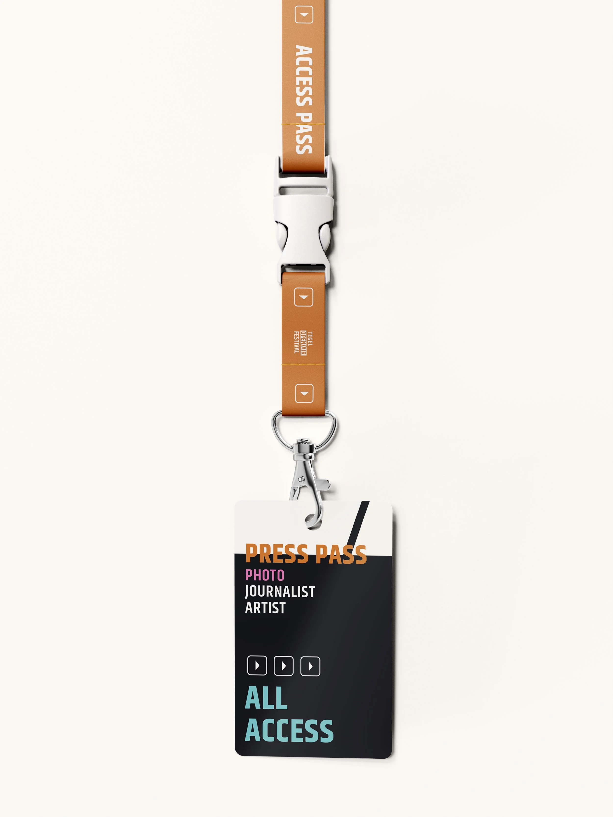
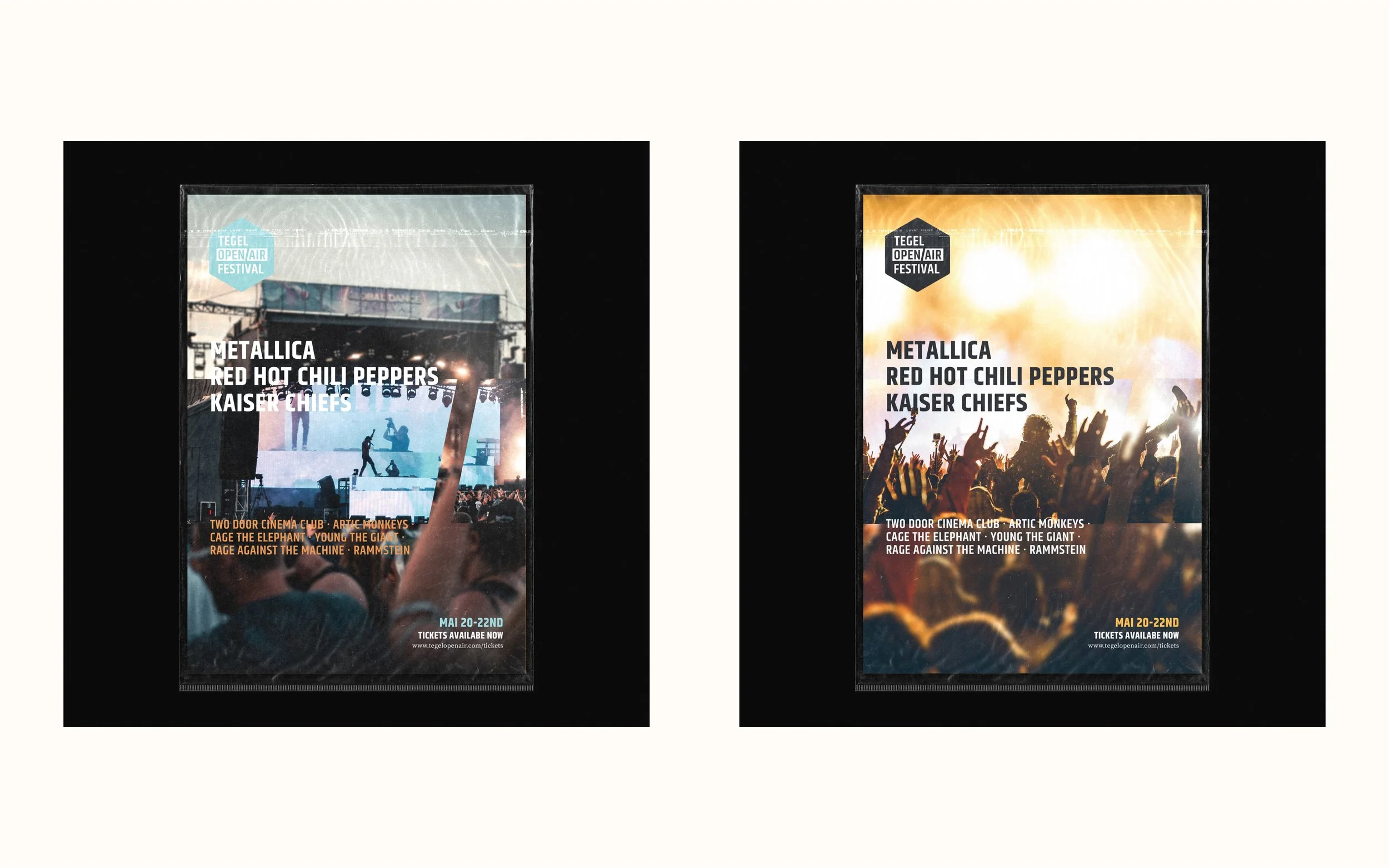
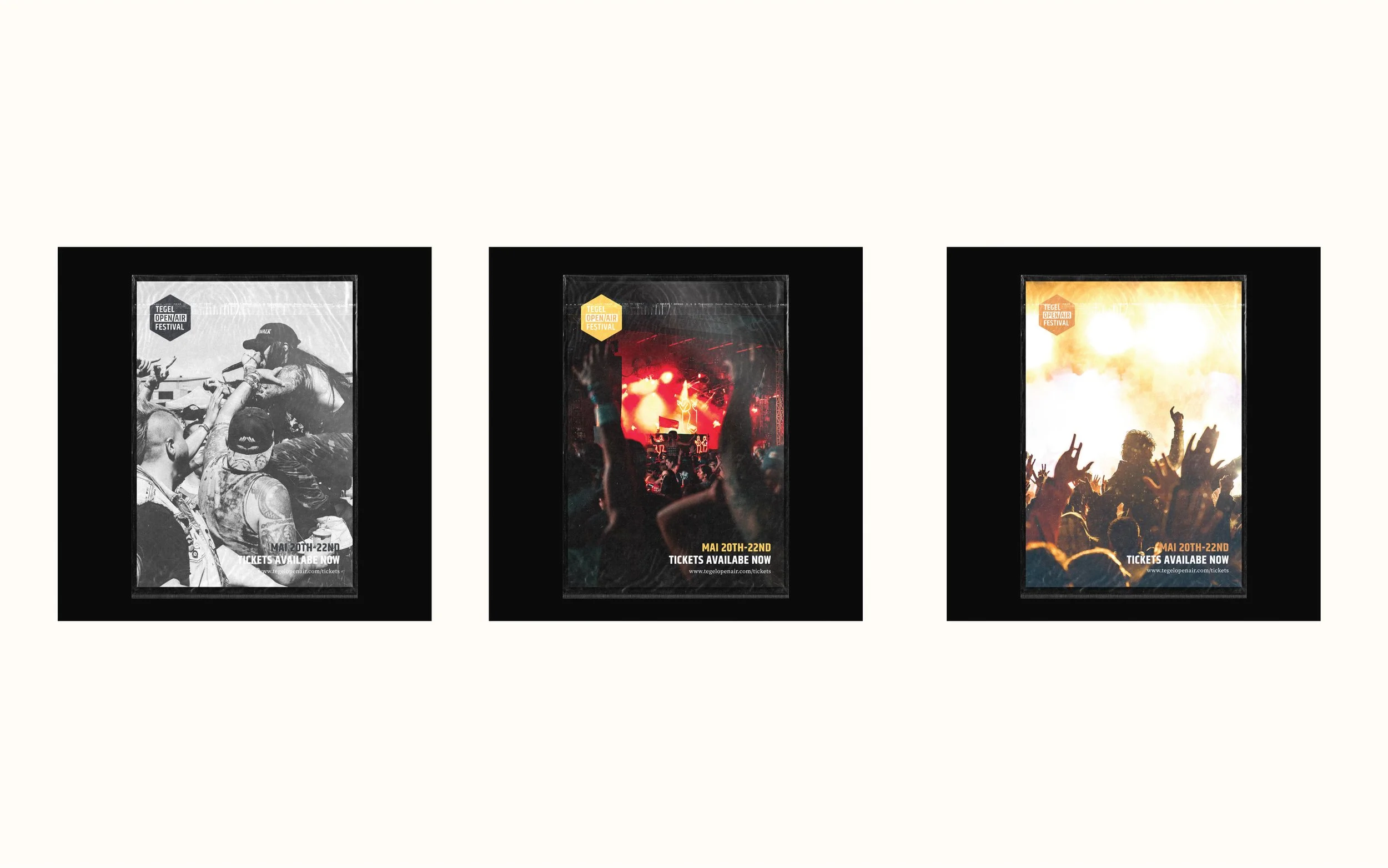
Inspired by the iconic architecture of the former Tegel Airport, I designed TOAF’s brand by incorporating airport elements and Tegel’s distinctive shapes. I mixed these elements with a vibrant and youthful communication style, creating a fresh, dynamic voice and an array of uplifting colors. This festival is dedicated to passionate music enthusiasts like myself, who have a vast and diverse love for music.
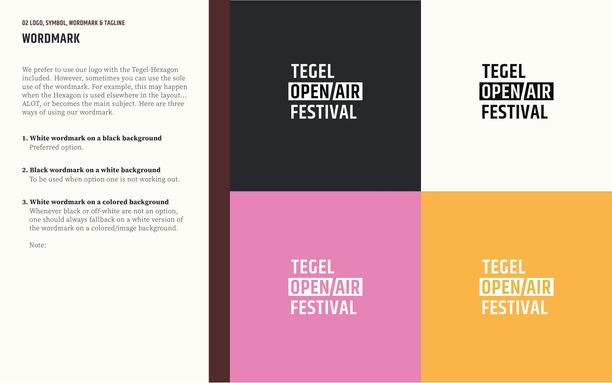
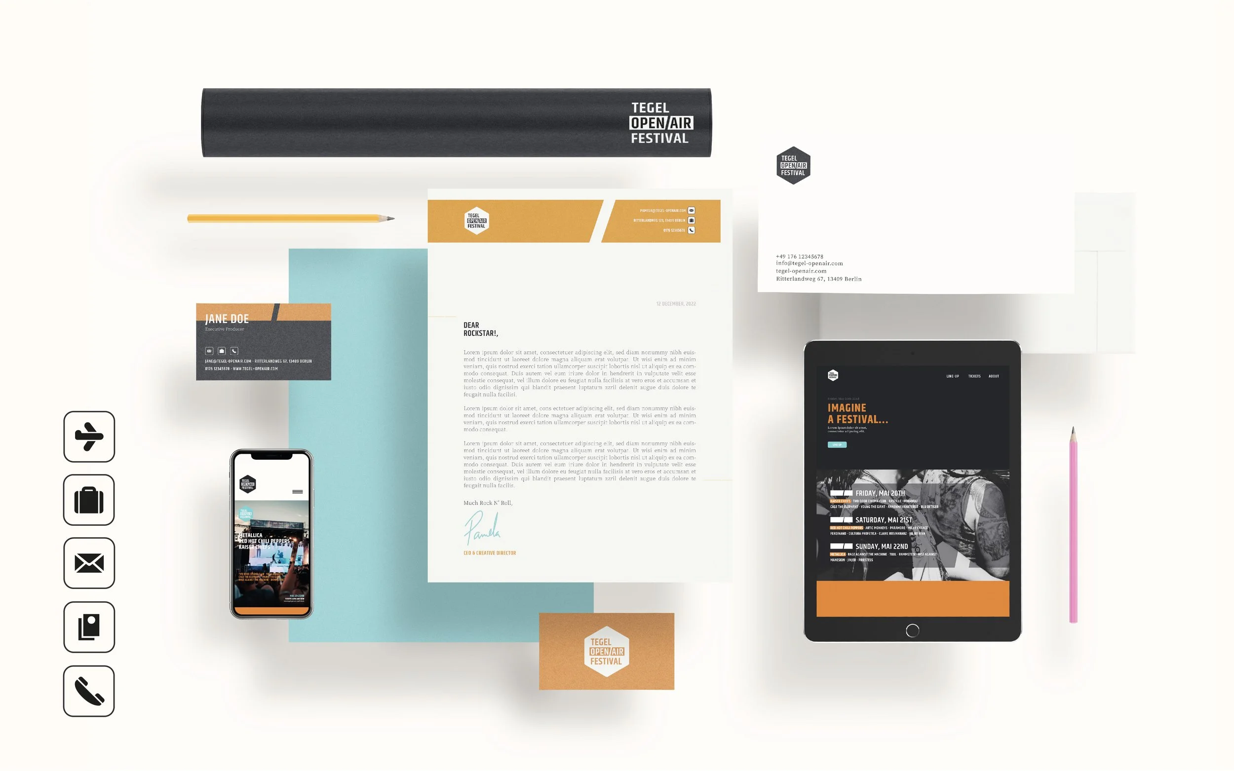
Tegel Open-Air Festival's logo brilliantly captures my inspiration, seamlessly showcasing the iconic architecture of Tegel Airport. It not only highlights the location but also ensures the logo is memorable and distinct, even in the smallest applications. The design cleverly integrates airport elements, making both the logo and icons a true testament to the unique vision.
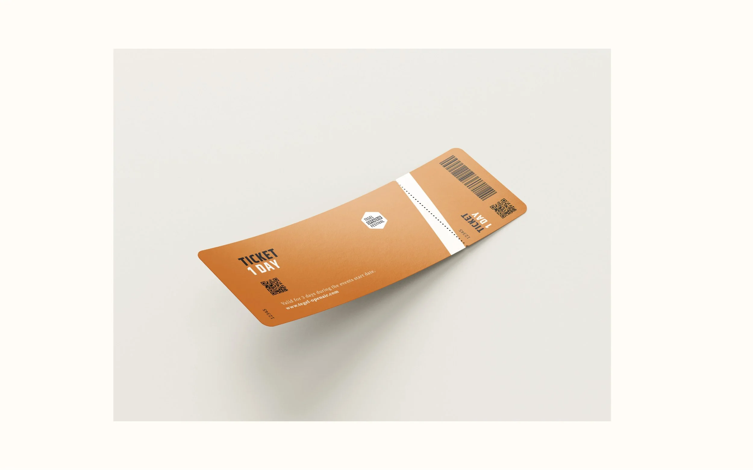
The brand’s color palette is meant to bridge marketing communications and product interface in order to enhance familiarity and visual recognition.
The Light Brown, Yellow-ish, Dark Brown and Black-ish are closely tied to the colors you see in product, while Airport Red, Purple and Turquoise are brought in to represent the colorful content from the users.


