Modular | Freelance
Create a space for
every music lover to find belonging.
Role: Art Direction + Layout Design
Client: Modular Magazin
Date: 09/2021
What is Tegel
Open-Air Festival?
Inspired by the iconic architecture of the former Tegel Airport, I designed TOAF’s brand by incorporating airport elements and Tegel’s distinctive shapes. I mixed these elements with a vibrant and youthful communication style, creating a fresh, dynamic voice and an array of uplifting colors. This festival is dedicated to passionate music enthusiasts like myself, who have a vast and diverse love for music.
Tegel Open-Air Festival's logo brilliantly captures my inspiration, seamlessly showcasing the iconic architecture of Tegel Airport. It not only highlights the location but also ensures the logo is memorable and distinct, even in the smallest applications. The design cleverly integrates airport elements, making both the logo and icons a true testament to the unique vision.
Logo
Design Process
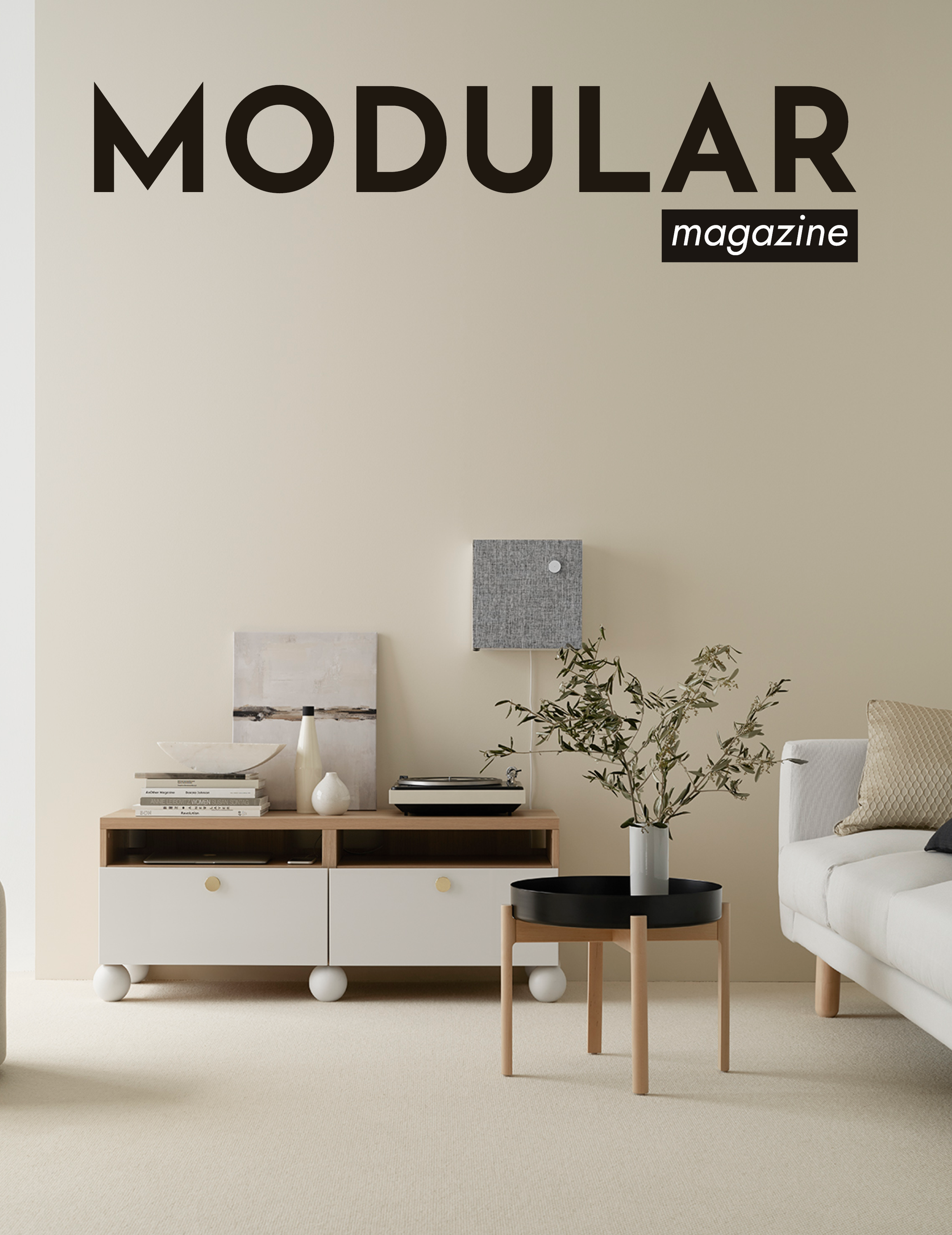
For my logo design process, I explored various typefaces and chose to focus on Sans Serif options to convey a sleek, contemporary aesthetic.
My goal was to reflect the essence of modern interior design and emerging trends.
I narrowed my selection to two distinctive styles: one with soft, rounded edges for a welcoming feel and another with sharp, angular features for a bold, dynamic impression.
Josefin +
Jost SemiBold Italic
Josefin had a sharp, angular style that felt sleek and modern—maybe even too modern for what I wanted to achieve. Its clean, geometric look seemed better suited for an architectural design magazine than an interior design publication.
While I admired its bold character, it didn’t quite fit the tone I was going for, so I chose not to use it.
Righteous + Rubik
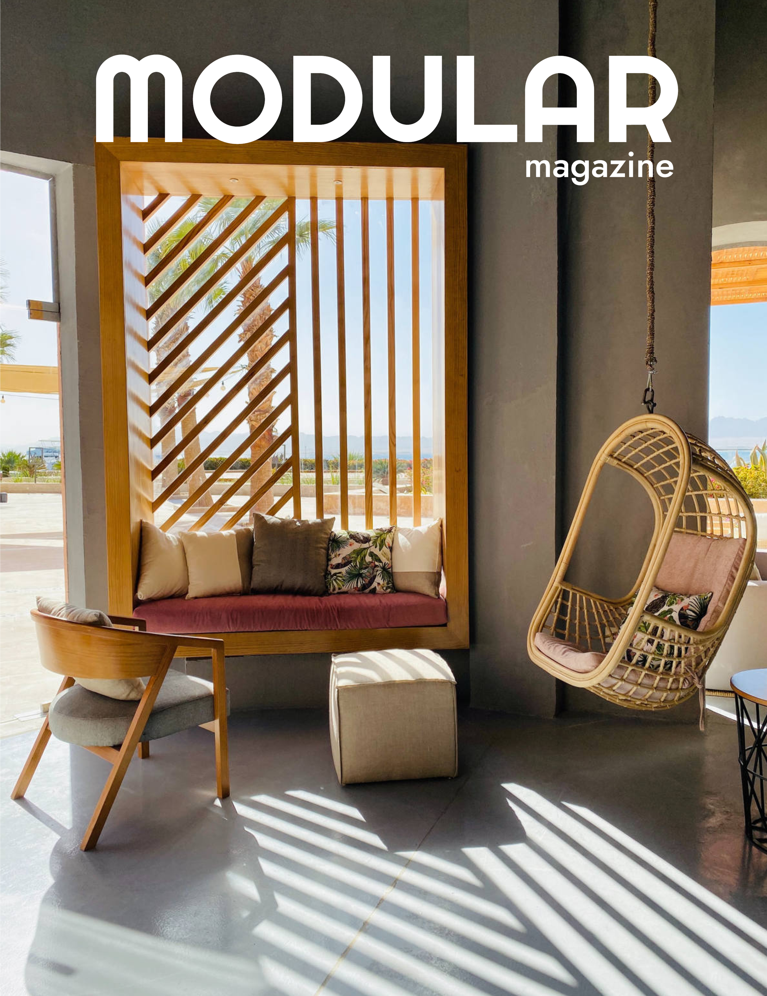
For my rounded typeface selection, I chose Righteous. Its distinctive M, A, and R stood out with bold personalities, making the typeface both unique and memorable. It struck a balance between soft modernity and a subtle nod to the 70s aesthetic. I crafted the design by combining the letters into a word, adjusting the kerning to enhance spacing. The result? A simple, modern, and effortlessly chic statement.
Righteous + Rubik
My final design had been on my mind since I typed the word "Modular" using the Righteous typeface—it just felt like the perfect fit. When I tried it, everything clicked. The logo reminded me of a sleek couch or neatly stacked books in a beautifully curated mansion library. To me, it captured the essence of modern interior design.


